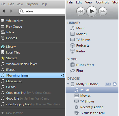
 Spotify has finally become a reality for US users after two long years of waiting. We had a chance to dabble with the European version before launch, and were able to put the American service through the wringer today. Here are our initial impressions on the music application. Spoiler alert: It’s good.
Setup
As it should always be, setup was the most painless part of the game. We entered minimal personal information about ourselves (with things like cell phone and gender being optional), and then began the download. It was exceptionally quick and within moments Spotify was up and running.
Connecting to Facebook was also simple. The right-hand side bar prompts you to connect to your Facebook account, and an application permissions box then pops up, asking for the standard data. After choosing “allow,” the side bar becomes dedicated to Facebook (which you can collapse if you want), and the left-hand side bar lets you search and scroll through music.

Installing the iOS and Android apps was similarly easy, and both allow you to sync your music over Wi-Fi. Without a premium account, you’re pretty limited, however. With one, you can listen to your Spotify playlists offline, or go online to access its library.
User Interface

From there, it’s pretty straight forward. Your library holds all the music you’ve acquired, and all the way at the bottom is the option to create new playlists, which line up above.
There’s a box for album artwork that corresponds to the tunes you have playing in the left hand bottom corner, which can be collapsed. The bottom page of the player holds your shuffle, repeat, play, skip, back, and volume controls, and the center is dedicated to your music navigation. The right-hand side is where your Facebook friends are displayed, and clicking on them reveals their public playlists, which you can subscribe to. The gear icon allows you to hide your friends, disable posting to Facebook, or disconnect altogether.
Within moments of clicking around, we felt extremely comfortable navigating the Spotify player. There are occasional advertisements that pop up, but they are unobtrusive and easy to ignore (if you can get over Pandora ads, this is nothing). It’s an intuitive layout that errs on the side of simple instead of flashy. And for the moment, its Facebook integration isn’t overwhelming – there’s no constant News Feed bubbling over or chat options: It’s just a way to see what your friends’ music.
Cons
With every music service there are a few kinks. Here are some of the first we’ve experienced with Spotify that you might want to keep your eyes open for.
Zune users: Microsoft may be issuing a slow death for Zune, but it’s a death nonetheless – and one that Spotify apparently acknowledges. Our writer Jeffrey Van Camp tried to sync his Zune and upload its content to Spotify with no success. He says the service simply didn’t recognize the device.
Your music is automatically public: We mentioned that Spotify auto-pulls in your WMP and iTunes libraries, saving you the trouble. Well you’d best know that if you are connected to Facebook, all of your playlists become public. Now, changing that is easy: Click on your Facebook profile icon in the upper right hand corner and choose “profile.” Then Click the edit icon. You’ll see green toggles, and you can slide them to turn off public Facebook access to your playlists.

Pros
There’s plenty to like about Spotify, and while it’s fundamentally the same as any other music streaming subscription service out there, a few features set it apart and could spell its major US success.

We’re wondering if the Spotify player’s Facebook feature will look any different when and if Facebook launches its integrated Spotify client. We almost hope it doesn’t: If you want the experience to be more about social than about music, head over to your Facebook account and use the application there. Time will tell.
Database: Spotify has 15 million songs. Compare that to MOG, which has 11 million, Pandora’s 800,000 titles, and Slacker, which had 2.4 million at last count (2009). In our initial run-through, we had no issues finding various types of music – including a couple more obscure choral pieces. Dragging and dropping titles to playlists was simple, and creating mixes couldn’t have been easier.
User interface: We’ve already been over it, but Spotify’s setup is extremely easy to use. We liked it better than most in-browser music players, which may have something to do with being so familiar with iTunes. It’s worth noting that the new Pandora UI coming soon reminds us a lot of the Spotify player.


