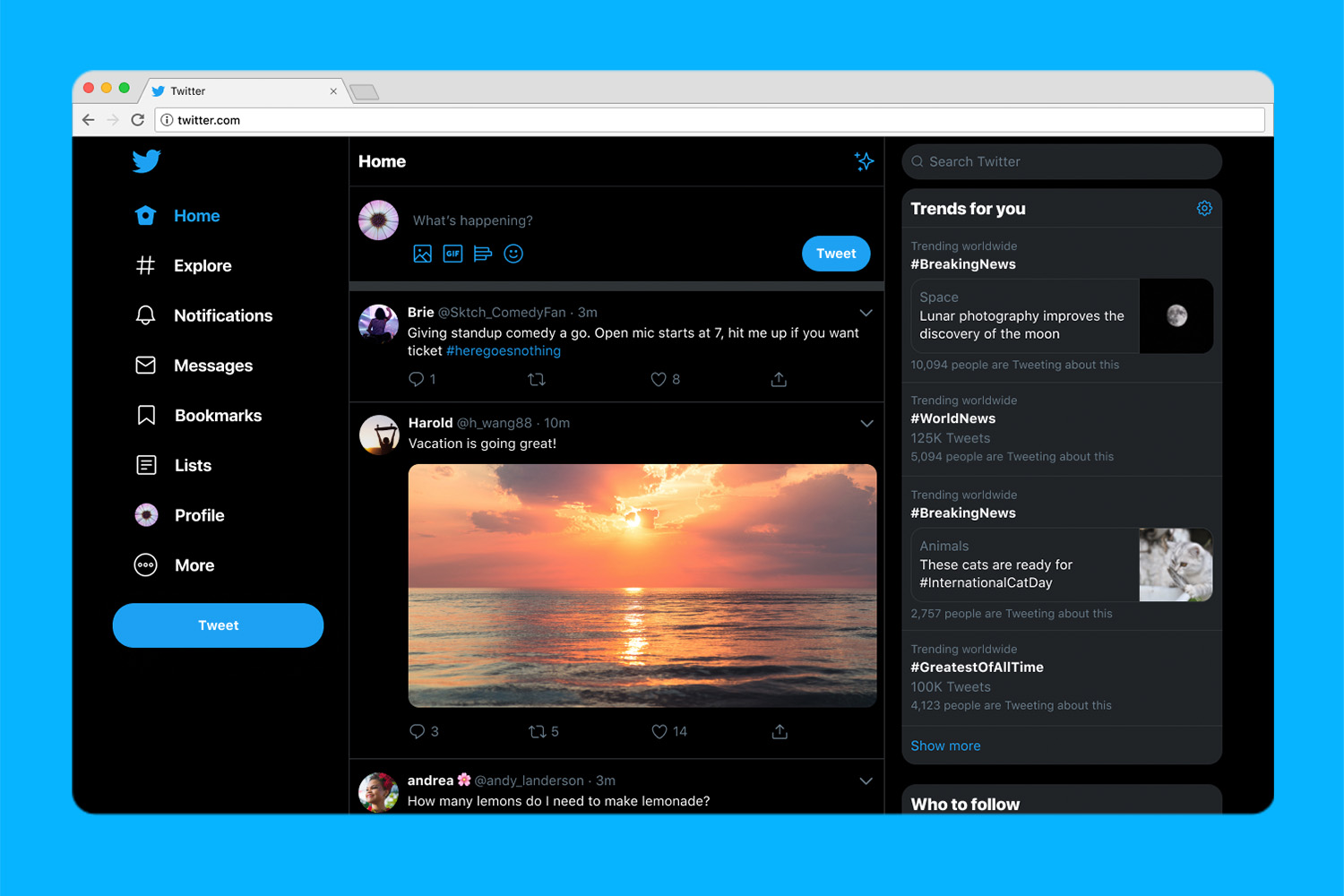
Twitter.com is looking a little more like the Twitter made for smartphone screens. On Monday, July 15, the social media platform rolled out a heavily anticipated redesign, bringing some of the tools of the app to the desktop experience, along with adding customization options, including a new dark mode. Twitter says the updated web platform is rolling out beginning today.
Twitter’s new look brings several features that will feel familiar for users of the mobile app. The Explore section of the Twitter app, which curates a collection of tweets and live video based on your interests and even physical location from accounts you don’t yet follow, is now part of the left-hand side navigation bat that also houses quick access to messages and your profile page. Bookmarks also make their twitter.com debut, while lists are also now faster to access from within that same navigation bar.
Tapping on the messages icon from that left sidebar opens a redesigned home for Direct Messages. Now, Twitter says the Direct Messages page allows users to see conversations and send messages without switching between screens.
The heavily anticipated dark mode also arrives with the redesign, though as an option that doesn’t ditch the old blue background either. The display settings now include the familiar “dim” dark mode the white text on a dark blue background, along with a new “lights out” option for white text on a black background. Twitter also added new themes to change the icons and design aspects that use Twitter’s iconic blue to another hue.
Both the dark mode and new color options are accessible within a few clicks by tapping on the more at the bottom of that new left navigation bar, then clicking on display. The same settings are also available from the display options inside the Settings menu.
The update also makes switching between accounts easier, using a quick log out option in the left navigation bar.
While the update brings a new look, new features and a handful of shortcuts, Twitter says the update is also designed to offer faster performance. But the company isn’t done making changes either — Twitter says the redesign also creates a better foundation for future updates to the platform.


