By now you’ve no doubt heard about Mastodon. It’s a social media platform that’s been bandied about as an alternative to Twitter, particularly among users who aren’t comfortable with the direction Twitter is going in now that Elon Musk is at the helm.
In fact, since Musk first announced that he was planning on buying the popular microblogging platform, Mastodon has garnered quite a bit of attention and experienced significant growth. But though you’ve likely heard about Mastodon, you may not be familiar with how it works or haven’t decided whether or not it would be a good fit for you if you ever choose to leave Twitter and need an alternative social media platform. Don’t worry. We’ve got you covered. In this guide, we’ll get you up to speed on everything you need to know about social media’s buzziest new platform.
What is Mastodon?

Mastodon became particularly prominent in the past year, but it has been around longer than that. The six-year-old microblogging platform was first launched in 2016 by developer Eugen Rochko. And while it does share similarities with Twitter, it was designed out of frustration with Twitter’s shortcomings. Many of Mastodon’s key features could be seen as efforts to correct (or avoid) certain issues Rochko felt Twitter struggled with.
The result was a new microblogging platform that isn’t owned by a single company and is instead a federated network of servers that are each run and moderated by members of those servers.
How it works
Mastodon calls itself “decentralized social media.” But what does that mean? Essentially, it means that Mastodon is not owned by one company as Twitter is. Mastodon is instead a social media platform that is made up of independently-run servers (known as “instances”), the members of which can still communicate with members of different instances.
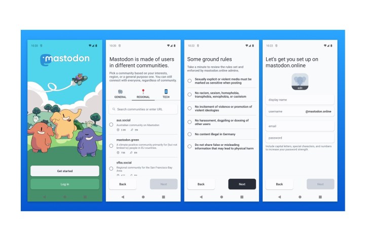
When you first sign up for Mastodon, you’re expected to join one of these instances. Creating a Mastodon account only happens from within them. Once you pick one to join, that’s when you’ll be presented with the application/account creation process. Each instance has its own set of rules and many of them are focused on specific interests. So you’ll want to make sure that those interests and rules align with your own. But don’t worry: You can move your account to another instance if you find a better fit elsewhere.
Once you’ve created an account on an instance and confirmed your email address, you’ll be logged into Mastodon, and if you’re on the web app, you’ll be presented with its three-column homepage where you can browse other users’ posts and create your own. These posts can be images, polls, text, video, and/or audio.
User interface/aesthetic

For the purposes of this guide and in the interest of brevity, we’re going to focus on the interface you’ll likely encounter if you choose to browse Mastodon via its official web app. But it is worth noting that because Mastodon is open-source software, there are also other third-party apps that you can use to access the platform. You don’t have to just use Mastodon’s official mobile apps and web app to access the service. That said, the user interface will vary depending on which apps you choose to use: Mastodon’s or one of the third-party apps.
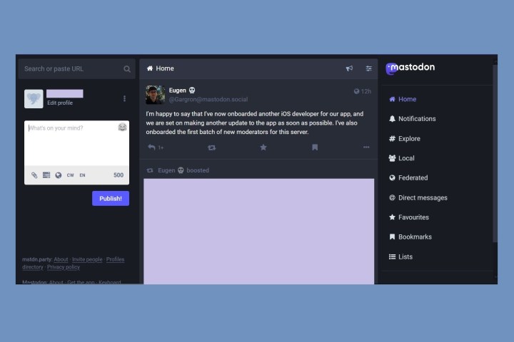
Once you’ve created an account via your chosen instance, you’ll see a homepage divided into three columns. From left to right, you’ll see a search and post creation column, a timeline column, and a main menu column. When it comes to Mastodon’s interface there’s a lot going on, and it’s best to break it down by some of the features you’ll likely encounter and/or use the most:
Toots and boosts
A post on Mastodon is known as a “toot.” A “boost” is the re-sharing of a toot, and is the equivalent of a retweet or reblog. The boost icon also resembles the retweet icon on Twitter, two arrows pointing toward each other’s tails. There does not appear to be an option to reshare toots with comments (like a quote tweet).
Favourites and replies
If you like a toot, that’s known as a “Favourite” and you’ll select a star icon to do so. If you want to reply to a toot, you’ll select the reply icon which looks like a leftward pointing arrow.
Bookmarks
Like, Twitter you can also bookmark posts to view them later in a separate Bookmarks section. You can bookmark a toot by selecting the ribbon icon.
Timelines: Home, Local, and Federated
There are three main timelines on which you can scroll through others’ toots: Home, Local, and Federated. Home is the first timeline you’re presented with when you first log in and it contains the posts of the accounts you follow, arranged chronologically. The Local timeline contains all the posts from the other members of your instance. The Federated timeline features posts (that are public) from all sorts of other instances and your own.
Direct Messages
While Mastodon does have a way for its users to communicate directly with specific users, the process for composing a DM won’t look like the process of doing so on Twitter or Facebook. On Mastodon, a DM is just a toot with visibility that is limited to the person you want to contact directly. But your messages will appear in a separate section called Direct Messages and they shouldn’t be visible to other users (besides your recipients). But there is no end-to-end encryption for these messages, and according to ZDNet, the instance admins can see them. So don’t treat Mastodon’s direct messaging feature as a private messaging option.
Explore
The Explore page is similar to Twitter’s Explore page in that it will show you trending topics and posts. It’s divided into four tabs: Posts, Hashtags, News, and For You. It’s a way for you to explore and discover more content on Mastodon.
The Posts tab shows you posts that are trending in your server. These posts don’t have to originate from your server though.
The Hashtags tab shows trending hashtags on your server and in other servers.
The News section shows trending news stories and links directly to them.
And the For You section appears to simply show suggested accounts for you to follow.
Advanced web interface
The “advanced web interface” is an option that you can enable to allow you to customize how your homepage looks on Mastodon’s web app. The main thing to know here is that when it’s enabled you can pin multiple timelines to your homepage, so you can view them all at once. It also allows you to pin Lists (which are timelines you create that only show posts from the accounts you add to them) and hashtag timelines. This means you can have more than the three columns you started with and you can follow other timelines besides Local, Federated, and Home.
Pros and Cons
Pros
- Posts are in chronological order.
- No ads or algorithms.
- Pretty customizable user experience. There are lots of preferences you can set to optimize your experience.
- You have more characters to express yourself. Up to 500 characters.
Cons
- While the user interface has some familiar elements, it does take some getting used to. It’s not intuitive right off the bat.
- Finding people to follow does require more work as there aren’t many options for suggested follows.
- Does not appear to have a process for account verification that all instances adhere to. Verification (if it’s even offered) may vary among instances.
Cost
There is no cost to use Mastodon. It is free to use. Some exceptions are:
- If you choose to use a paid third-party app to access it, instead of just using a free third-party app or Mastodon’s official free mobile apps or web app.
- If you choose to run your own server on Mastodon, there may be out-of-pocket costs to keep it running.
Platform availability
You can access Mastodon via its web app on a web browser, via its mobile apps for Android and iOS, or via a wide variety of free and paid third-party apps.


