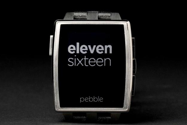
“The Pebble Steel is a beautiful waterproof Pebble. It isn’t very intelligent yet, but it’s the best smartwatch out right now.”
- Classy stainless steel design
- Waterproof
- Fast, crisp LCD display
- 4-7 day battery life
- More apps than other smartwatches
- Same specs as the first Pebble
- Requires a lot of phone tethering
- Notifications cannot be controlled
- No battery life indicator
- Screen lacks color and touch
- App selection limited
Samsung’s Galaxy Gear may have outsold the humble Pebble smartwatch, but the little Kickstarter-grown project has been a cult favorite since its rollout last year. And now the little smartwatch that could is back, and all grown up. The Pebble Steel is essentially a dressed-up version of the same watch, sporting a waterproof steel frame. But priced at $250, is it worth the $100 premium over its predecessor?
Finally, a smartwatch we want to wear
The original Pebble isn’t hideous, but it’s not what we’d call an attractive watch. It has geek cred, but no street cred, and it’s a little too bulky for its own good. The Pebble Steel is what the Pebble should have looked like from the start.
Though it has nothing on Derek Zoolander’s Blue Steel, the Pebble Steel is still really really … really ridiculously good looking.
The Pebble Steel is shorter and thinner than its predecessor in all three dimensions, but its metal chassis does raise its weight from about 1.3 oz to nearly 2 oz. Still, it’s hardly bulky. It still has the same four buttons and 1.26-inch screen as the first Pebble.
There are other upgrades, too. The magnetic charging port fits on nicer and despite being made of metal, the Steel is waterproof enough to swim with or take in a rainstorm.
Though it has nothing on Derek Zoolander’s Blue Steel, the Pebble Steel is still really really … really ridiculously good looking. Well, maybe not that good looking, but it has some class.
Touchless steel
The Pebble Steel works fine without touch controls, but navigation can get confusing. Replacing a touchscreen are four buttons – one on the left and three on the right. The top and bottom right buttons let you scroll up or down through the menus, while the middle right and left button both seem to have the same function: they exit and enter menus. Mostly, the right button enters and the left is used to exit, but there are areas where the interface gets pretty layered, making the watch’s navigation a little confusing. We sometimes tap both buttons hoping one of them will exit or enter the menu we want.
A touchscreen won’t solve this problem, which is partially caused by trying to work on a small 1.26-inch 144 x 168 black and white screen. The LCD screen has a backlight, but it’s not strong.
It’s smart, but it can’t pass the SATs
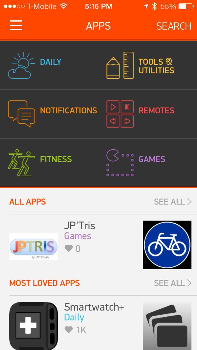
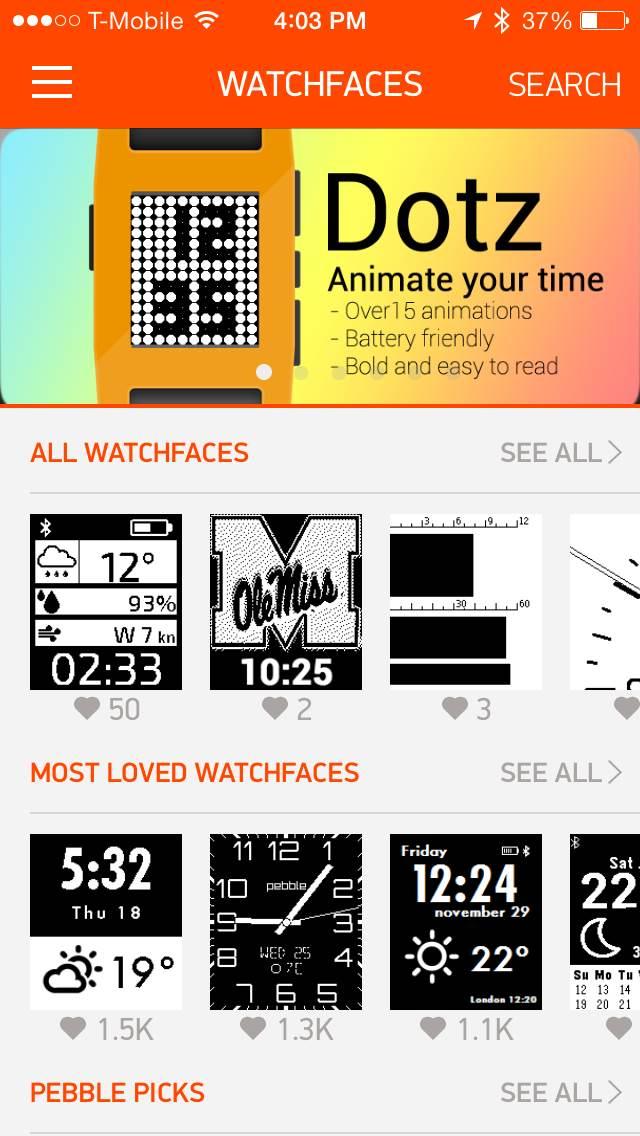
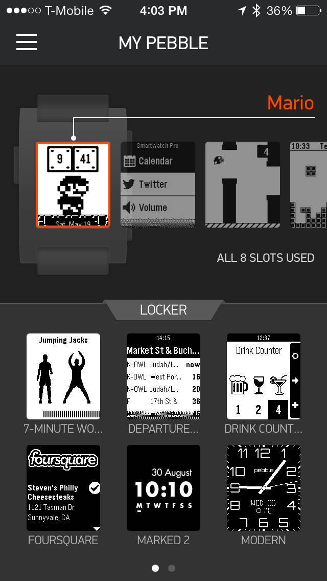
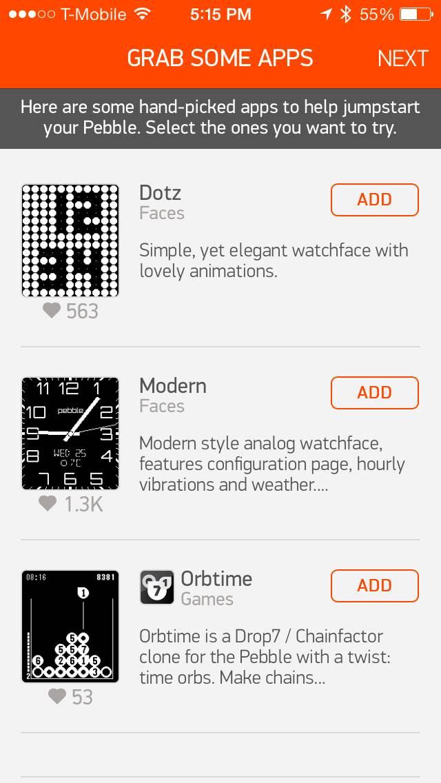
The Pebble Steel is an upgraded version of the original Pebble, but on the inside it’s virtually the same. It can still only hold eight watchfaces or apps at a time, needs you to connect it (via Bluetooth) to an iPhone or Android device, and forces you to use a phone app to do most of the heavy lifting.
Either you get every notification, or you get none of them.
We want a smartwatch that isn’t chained to our phone. You can’t even remove apps or watchfaces from the Steel without your phone.
Did we mention there’s no battery meter? You’ll have to find an app for that, or wait for the Pebble to warn you that it’s low on battery. This was a problem from the first watch that still isn’t fixed.
Having said that, the Pebble developer community is active and enthusiastic. The apps are more creative than what we’re seeing on other smartwatches, and a few show real promise.
Too many notifications!
One of the promises of the smartwatch, and one of the only ways many of them are considered “smart” at all, is their ability to show you phone notifications and messages. The idea is that a smartwatch will save you from pulling your phone out as often. Pebble can do this, but there’s no way to control the hose. Either you get every notification, or you get none of them. There’s no way to tell it to not vibrate for emails or only show you texts. It’s all or nothing, baby.

You can, of course, go into each app and tell it to stop sending notifications, but a phone notification isn’t as bothersome as your wrist vibrating, and doesn’t always command your attention. Martian’s half-smart Notifier watches let you choose how to manage notifications … why not Pebble?
It can hold a charge for several days
We complained earlier about the Pebble Steel’s lack of a battery meter, but we can’t yet complain about its actual battery life. After three days of continuous use, we’re at about 30 percent battery life, which isn’t as good as the 7-day promise, but we probably get more email than your average user. Under our heavy usage, it should get at least 4 days of juice, and that’s not bad. Unlike the Qualcomm Toq and Galaxy Gear, it’s really easy to snap on the magnetic charger.
Conclusion
The Pebble Steel is a far better-looking watch than the Pebble, but no smarter. If you buy the $250 Steel, you’re paying an extra $100 for better design and a watertight seal. Still, $250 is far less than the $350 Toq or $300 Galaxy Gear. Its only real competition is the $200 Sony Smartwatch, which almost looks as classy and packs a colorful touchscreen. But even Sony’s watch has a limitation: It doesn’t work with iPhones.
Like the $150 Pebble, the Pebble Steel is the most well-rounded smartwatch out there. It will work with almost any phone (sorry, no Windows Phone), can match the worthwhile capabilities of its toughest competitors, and now it looks good doing it.
Smartwatches aren’t done evolving yet, but the Pebble Steel does a lot of things right.
Highs
- Classy stainless steel design
- Waterproof
- Fast, crisp LCD display
- 4- to 7-day battery life
- More apps than other smartwatches
Lows
- Same specs as the first Pebble
- Requires a lot of phone tethering
- Notifications cannot be controlled
- No battery life indicator
- Screen lacks color and touch
- Limited app selection


