WatchOS 3 steams out many of the remaining wrinkles in the always evolving Apple Watch.
Apple’s first version of WatchOS wasn’t as bad as it could have been, and compared to Android Wear at the time, it was downright genius. However, two big problems plagued the Apple Watch and its software: speed and simplicity. WatchOS was just too damn slow and too damn complicated.
We’re pleased to say that Apple has fixed both problems in one go with WatchOS 3.
We loaded the beta software on our Apple Watch months ago to find out if our apps would finally load and if the Apple Watch would finally be as easy and intuitive to use as the iPhone. But first, we had to download the Minnie Mouse watch face, which is really the best part (kidding … or am I?). Now that we’ve used WatchOS 3 for a few months and it’s officially available to download, here’s our full review.
You can download WatchOS 3 on your Apple Watch now. Just check the Apple Watch app on your phone to see if it’s ready. You’ll need to have your phone on iOS 10 first. WatchOS 3 comes pre-installed on the new Apple Watch Series 2.
Fun watch faces are easy to get
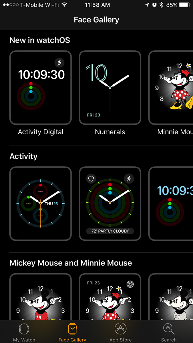
What’s a watch without a face? A good watch face is everything, and Apple sure has some beautiful new ones in WatchOS 3. Just like Mickey before her, Minnie Mouse is the star of the show. She’s adorable, playful, cheerful, and everything a girl could ask for. Most of the other watch faces skew male, which is bizarre, because based on personal observation, many more women are wearing Apple Watches than men. Minnie Mouse is a welcome addition to the mix, and you can even change her outfit to match your own.
In contrast, the new Numerals watch faces are simple and classy, but with a fun pop of color. If you loved Apple’s brightly-colored, swirling fitness tracking rings, you’ll be pleased to hear that they are now also in a series of gorgeous watch faces. That way, you can see your progress without having to open the Activity app. You also get a fun, colorful watch face out of the bargain.
If you’re into complications on your watch face, you’ll be glad to hear that a number of new ones have been added, and you can even put third-party app complications on your watch faces. These tiny icons can do anything from telling you the time in Tokyo to reminding you that your flight’s about to take off. Your best option for complications is the Modular watch face, though many others offer them, too.
All of these faces are easier to get right on your Apple Watch by swiping through them all; you no longer have to use Force Touch to change your watch face. You only have to use it if you want to change the color or style of your watch face. It’s much simpler and more intuitive.
Just like Mickey before her, Minnie Mouse is the star of the show.
Additionally, the iPhone app now has an entire tab dedicated to faces. There you can see all the different combinations and variations on your favorite watch faces and check what other colors they’re available in. Although third-party watch faces aren’t supported yet, we hope that this means Apple will soon open a store for alternatives in the near future.
Android Wear already has numerous third-party watch face apps, and Google itself has forged many partnerships with famous brands to get fun faces on
Apps actually load!
When the Apple Watch first arrived, developers stumbled all over each other trying to get their apps on the new device. Although a wealth of apps debuted along with the first version of WatchOS, almost none of them would load when you tapped on the icon. You sat staring impatiently at a spinning wheel on your watch anytime you tried to open a third-party app. It was like having dial-up internet all over again, which is to say, it was torture. Your best bet was to put your favorite apps in Glances, which were quick to access with a swipe of the screen. Glances were limited, though, and it seems that no one really used them much.
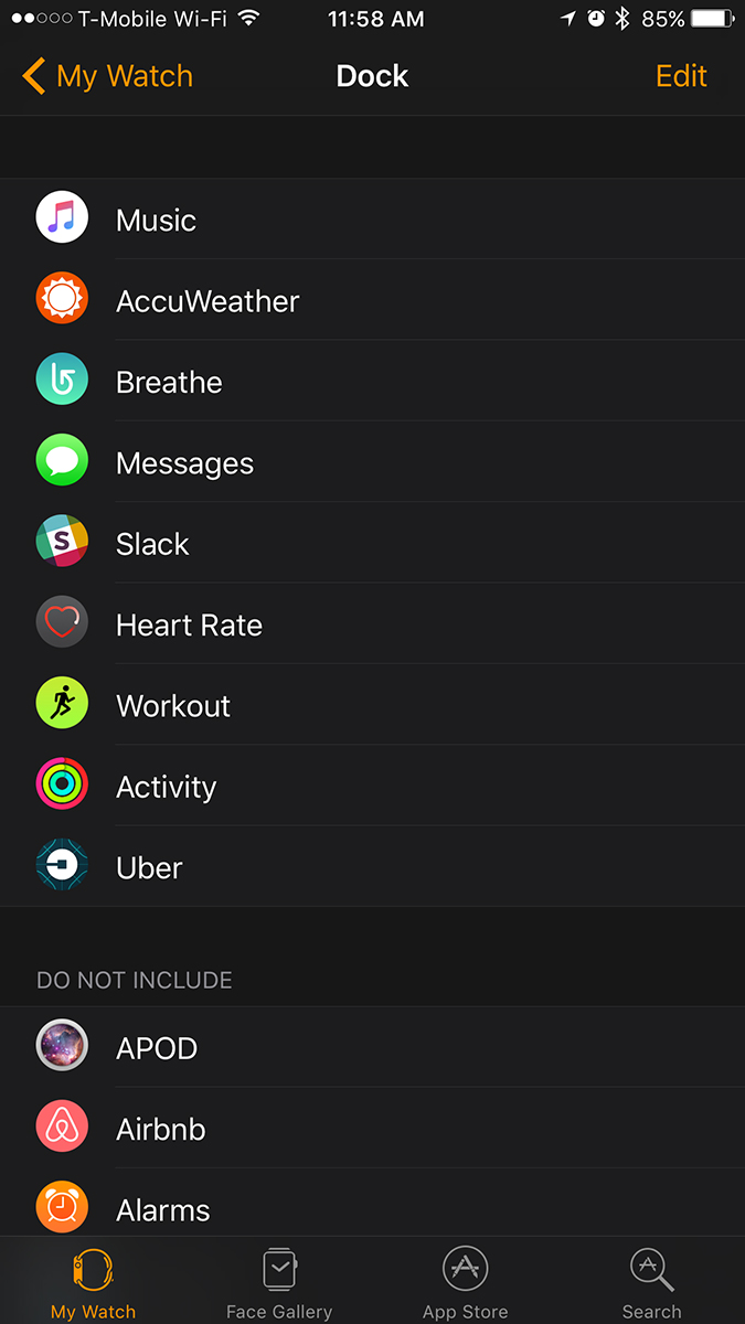
In WatchOS 3, Apple replaced Glances with Dock, a place where you can set the 10 apps you use the most. These apps are pre-loaded, so that when you touch one, it actually pops up immediately. The first time you set up the Dock, you’ll have to tap on each app to load it, which takes a few seconds, but after that, the apps in your Dock are always on call. It’s a brilliant feature that’s simple, fast, and intuitive. With a touch of the side button, you can see all the apps in your Dock and quickly access the info you need, whether it’s the weather, your heart rate, or the location of the closest Uber.
Now that WatchOS 3 is available to download, many more apps are available to dock and more should be updated soon. The Uber app is absolutely perfect. It tells you how far away the nearest Uber is and has a Request button right below the time. You simply tap it to hail an Uber. This is how every Apple Watch app should work. Tap once to summon it (it loads immediately), and tap one more time to take action. Done. No fiddling around, no finding the feature you need, just instant access to what you want.
The whole point of smartwatches is convenience, but until now, they’ve been pretty damn inconvenient to use. WatchOS 3 aims to change that, and with the help of developers, it will succeed.
Breathe is awesome
Being a journalist is stressful. Being a journalist in NYC is even more insane. Sometimes, you just forget to breathe. You come home with your shoulders keyed up to your ears and a creaking neck. Reminding yourself to breathe and take time for yourself in the modern world is a bit difficult, and even if you have meditation or mindfulness apps on your phone, it’s easy to forget. Luckily, the Apple Watch now has a new feature called Breathe.
Much like the “Time to Stand!” notifications the Watch sends, the “Time to breathe!” notifications are amazing — if you actually do it when the Watch says so. Breathe is arguably better, in my opinion, because the Watch actually guides you through a breathing exercise for a minute or more.
A beautiful, shimmering pale blue cloud expands and contracts just like our lungs when we breathe. The Watch provides haptic feedback, which feels like butterfly wings against your wrist to guide you along if you close your eyes while doing the exercises. The pale blue dot expands, and you fill your lungs with air; the cloud contracts back into a dot, and you slowly exhale.
It is the most restful, wonderful thing you can possibly do during a stressful day. It made me want to wear the Apple Watch again, if only for that feature. Other wearables can guide you through this with an app and music, but all of them require extra effort. You have to open the app, put on your headphones, and go through the exercise. With Breathe, you don’t need headphones or anything else — you just need your Apple Watch. You can set repeating reminders to breathe throughout the day or keep Breathe in your app Dock for quick access. That way, all you have to do is start breathing.
Reply to messages and other tidbits
WatchOS 3’s other new features are less momentous but still cool. One of them has to do with replying to messages. Previously, you had to use your voice, a handful of emoji, or canned responses. Now you can write on your watch to reply. It sounds stupid, and I thought it was when I first tried it on Android Wear. It may be awkward and dumb to write on such a small screen, but it’s better than nothing. Since there’s no keyboard, scribbling a reply on your wrist is sometimes necessary.
You will need patience. Three letters take up the whole screen, so you have to pause in the middle of most words. You’ll also need to remember to hit Space each time you finish a word, and the Watch does not understand cursive.
Breathe made me want to wear the Apple Watch again, if only for that feature.
Overall, it is annoying, and you probably won’t use it much. You can also send your heartbeat or a touch to someone who has iMessage now. Before, you could only send those interactions to fellow Watch wearers, which really limited its use cases.
Another new feature called SOS lets you use a button combination to alert emergency crews, send your location to your emergency contact, and so on. We didn’t test it out for obvious reasons, but we imagine it will be very useful in times of crisis.
Conclusion
WatchOS 3 is a big leap forward for the Apple Watch. It simplifies the interface, improves app speeds, and brings smart new features to the table. As app developers improve their apps for the wearable, things will only get better. Combined with the updated processors in the Apple Watch Series 1 and Series 2, WatchOS 3 should make the Apple Watch better than ever. Wearables and smartwatches, in general, have a long way to go before they’re perfect, but so long as we’re moving in the right direction, all should be well.
Highs
- Apps load way faster
- Easier to switch watch faces
- Breathe mindfulness app
Lows
- Writing on a watch is inane


