You can now customize your Moto 360 however you want with Moto Maker

Moto 360
Image used with permission by copyright holder
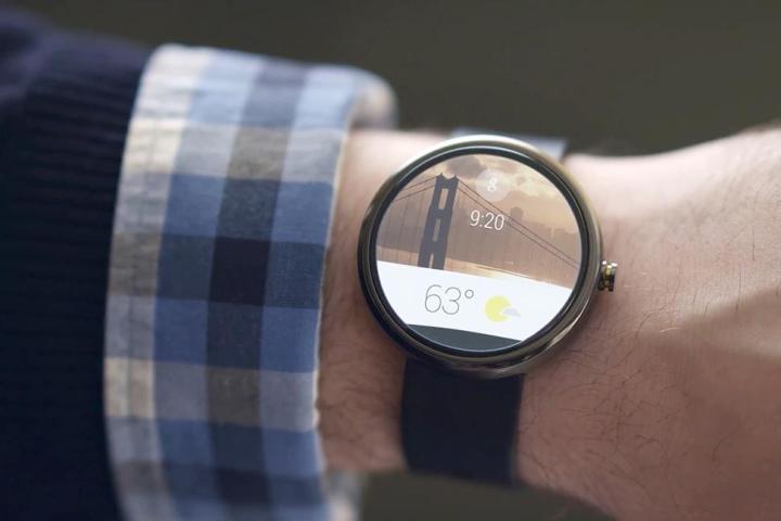
The much-ballyhooed Moto Maker has, right on schedule, made room for the Motorola’s Android Wear-powered smartwatch, the Moto 360. Like the Moto X before it, the Moto 360 is replete with a number of design choices customers can make before they order. In total, there are three finishes, nine bands, and 11 faces to choose from: a dark metal, light metal, or “champagne gold” exterior; single-toned leather, metal, and link wrist straps; and a range of time-telling digital displays.

The options here aren’t exactly new. With the exception of the now-delayed metal link wristband, every material has been available for purchase in some configuration — but Moto Maker may now be the easiest way to customize the Moto 360. Previously, Motorola recommended visiting a jeweler to install aftermarket bands.

Recommended Videos

Moto Maker recently caught flak from none other than senior vice president of design for Apple Jonathan Ive, who, in an interview with The New Yorker, called any program which let customers change outwardly facing elements of their phones “abdicating […] responsibility as a designer.” Motorola’s president Rick Osterloh later responded, arguing the end user “should be directly involved in the process of designing products.”

Controversy aside, Moto Maker seems like a natural fit for accessorized tech. Selecting watch bands before you buy seems especially logical. Despite Ive’s comments, then, I wouldn’t be entirely surprised to see an equivalent selector for the Apple Watch eventually.

Kyle Wiggers
Former Digital Trends Contributor
Kyle Wiggers is a writer, Web designer, and podcaster with an acute interest in all things tech. When not reviewing gadgets…
You can fix your own iPhone screen, but you may not want to
Person fixing an open iPhone with tool on a blue table.

Apple surprised us last year when it announced a new self-service repair program to allow iPhone owners to replace their own broken screens, aging batteries, and other key components.

That program finally launched last month, although, at this point, it’s limited to the iPhone 12 and iPhone 13 families. Nevertheless, if you’re thinking that this may finally let you fix your own screen, you might want to take a closer look at the various other service options available. Apple’s new Self Service Repair program isn’t for the faint of either heart or wallet.
How much does Apple charge to replace a screen?
Unless you have AppleCare+ (more on that later), you’ll need to shell out between $229 and $329 to have your iPhone 12 or iPhone 13 screen professionally replaced at an Apple Store. The exact amount depends on whether you own an iPhone 12 Mini or an iPhone 13 Pro Max.

Read more
Live in Arizona? You can now use your iPhone as your ID
Person accessing a state ID using the Apple Wallet on an iPhone.

Apple has finally been cleared to allow its Wallet ID functions to be used for driver's licenses and state IDs. The state of Arizona now accepts both forms of documentation as legitimate when displayed in the Wallet app on iPhones and Apple Watches, Apple announced today.

By adding the proper documentation to their Wallet, users will be able to effortlessly get through select TSA security checkpoints by simply tapping their iPhone or Apple watch on marked identity readers at Phoenix Sky Harbor International Airport. The tech hasn't made its way to all Arizona airports yet, but Apple has made it clear that it's looking to expand the reach of its Wallet's digital IDs as legitimate documentation.

Read more
You can now download the first Android 12L Beta on your Google Pixel
Android 12L shown for a larger display.

Google announced on Wednesday the first beta release of Android 12L, the next feature drop for the recently released Android 12 operating system. Aimed primarily at tablets and larger-screened devices, Android 12L will focus on changing the Android experience from the much-critiqued blown-up-phone look to a discrete experience that takes the larger canvas of tablets into account.
What's new?
Today's beta release includes the refreshed interface for larger screens, including a column view for the notification shade and lock screen. A new multitasking dock is being introduced to allow faster access to split-screen and drag-and-drop, and Google's now done work to allow every Android 12 app to work with split-screen mode regardless of whether developers have built for it.

The big problem with big-screen Android
Unlike iOS, the Android experience on tablets and larger-screened devices has been abysmal. It's a little understandable when one considers that Google shifted its tablet focus from Android to Chrome OS a few years ago. While Chrome OS currently has a decent tablet experience, one that the current Android 12L seems to want to replicate when looking at the dock and split-screen multitasking, the app experience for both has remained lacking.

Read more