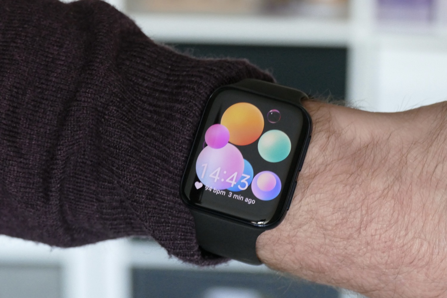
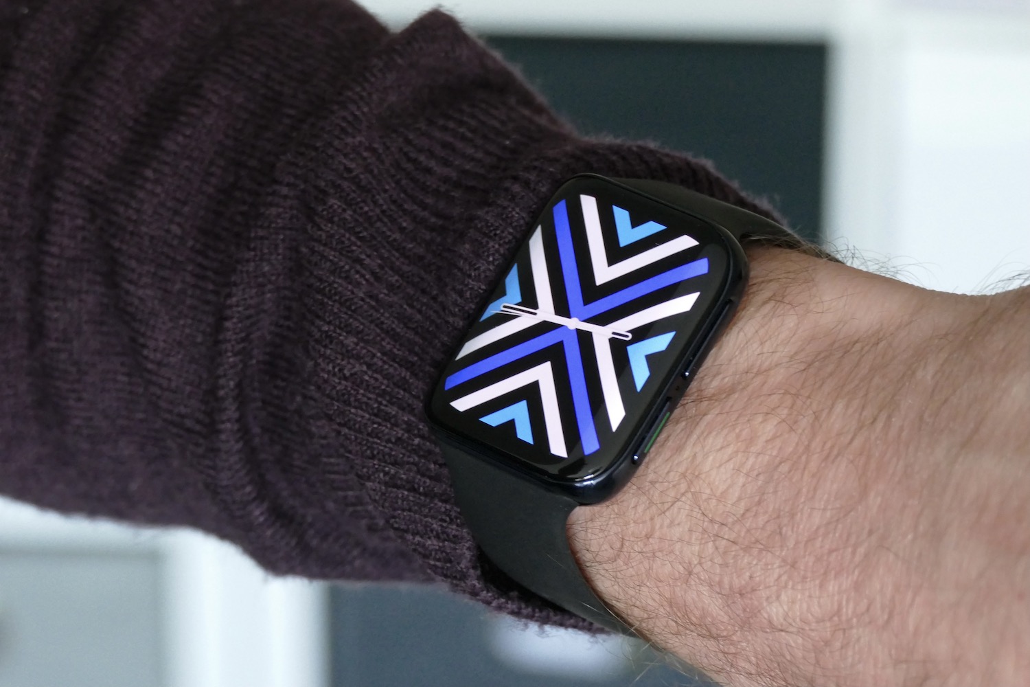
The Oppo Watch is a very confusing thing. On one hand (or should that be wrist?), it’s a highly capable, superbly made smartwatch that manages to put some much-needed pep into the aging Qualcomm Snapdragon Wear 3100 platform that’s inside it. On the other hand, the derivative design is incredibly frustrating, and it actually ended up making me quite angry.
Does the design matter that much? After all, it’s not like Oppo or Android phone owners can use an Apple Watch. True, but the trouble is, the similarity with Apple’s wearable is so obvious that it detracts from the Oppo Watch’s ability.
Doppelgänger
The first Amazfit GTS had a similar design to the Apple Watch Series 6, but it never pained me because the software and overall experience was poor, so I didn’t want to use it much anyway. The Oppo Watch is one of the best Snapdragon Wear 3100-based, Google Wear OS-equipped smartwatches I’ve used this year, even if it is an old chipset that has been superseded by the Snapdragon Wear 4100. Its performance is up there with the Suunto 7, but not quite as slick as the Mobvoi TicWatch Pro 3.
Its speed makes me want to wear it, and that means I would see the way the Oppo Watch looks on my wrist all the time. And it annoyingly looks and feels like an Apple Watch.
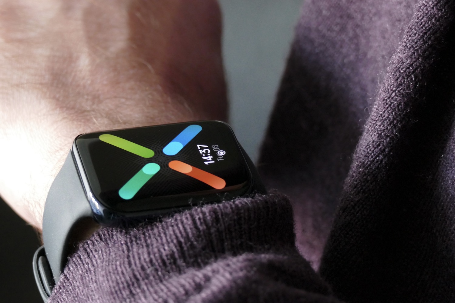
I’ve been wearing the 46mm model with an LTE connection, although the LTE feature isn’t operational. It weighs 67 grams with the strap, has a 13mm-thick aluminum body, and a 1.91-inch AMOLED screen with an impressive 402 x 476 pixel resolution. The screen is beautiful, and also very bright. The Snapdragon Wear 3100 chip pairs with 1GB of RAM and 8GB of storage. You also get NFC, 5 meters of water resistance, and a choice of black or gold color schemes.
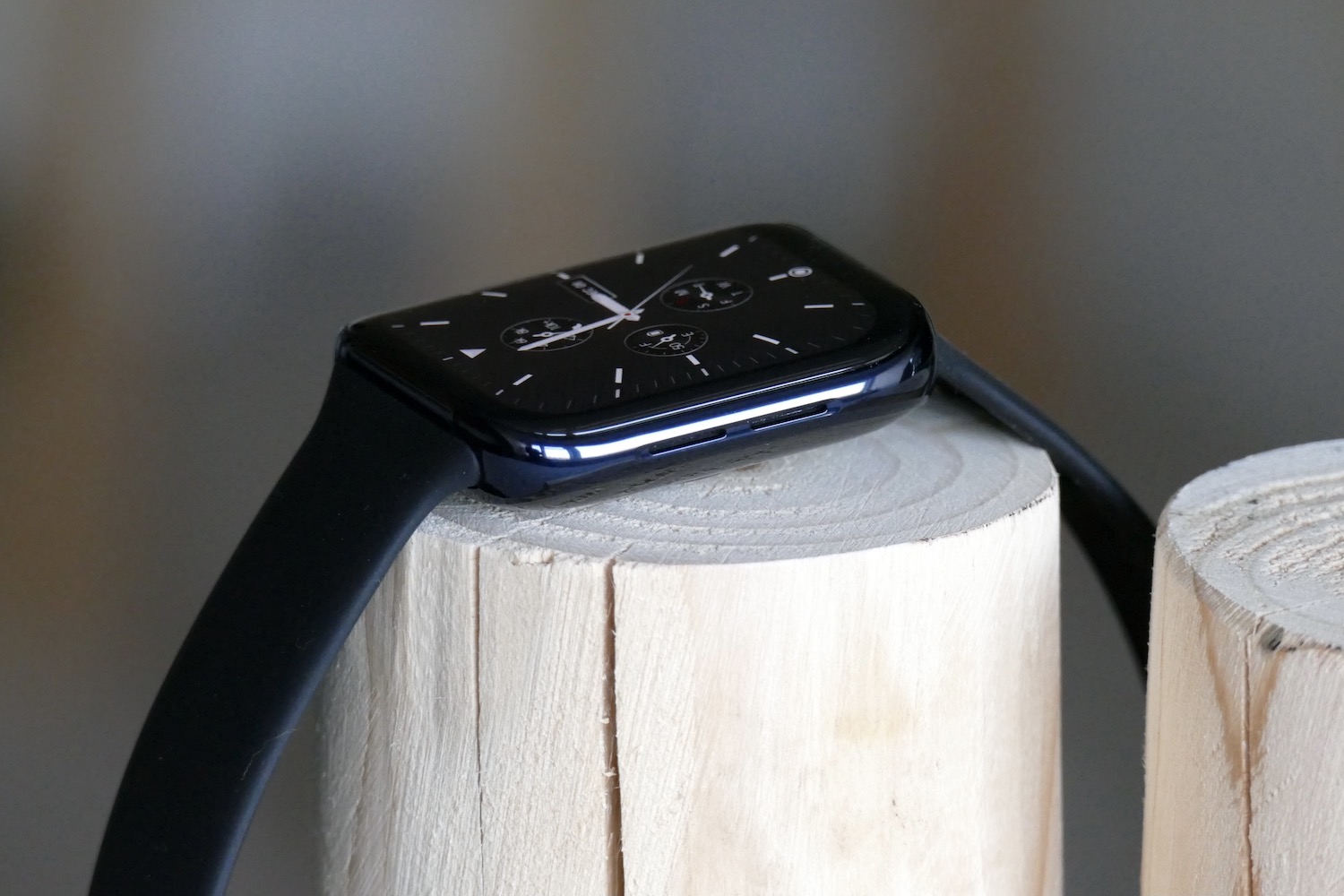
The shape lends itself perfectly to wearing on your wrist. The flat sides mean it never digs into your wrist, the smooth, curved ceramic case back doesn’t get hot and sweaty, and the screen is perfectly shaped for swiping. The screen’s highly curved sides do differentiate it from the Apple Watch, and actually recall Oppo’s Find X2 Pro smartphone screen rather than a smartwatch’s screen. There’s also no crown on the body, so it avoids being an absolute carbon copy.
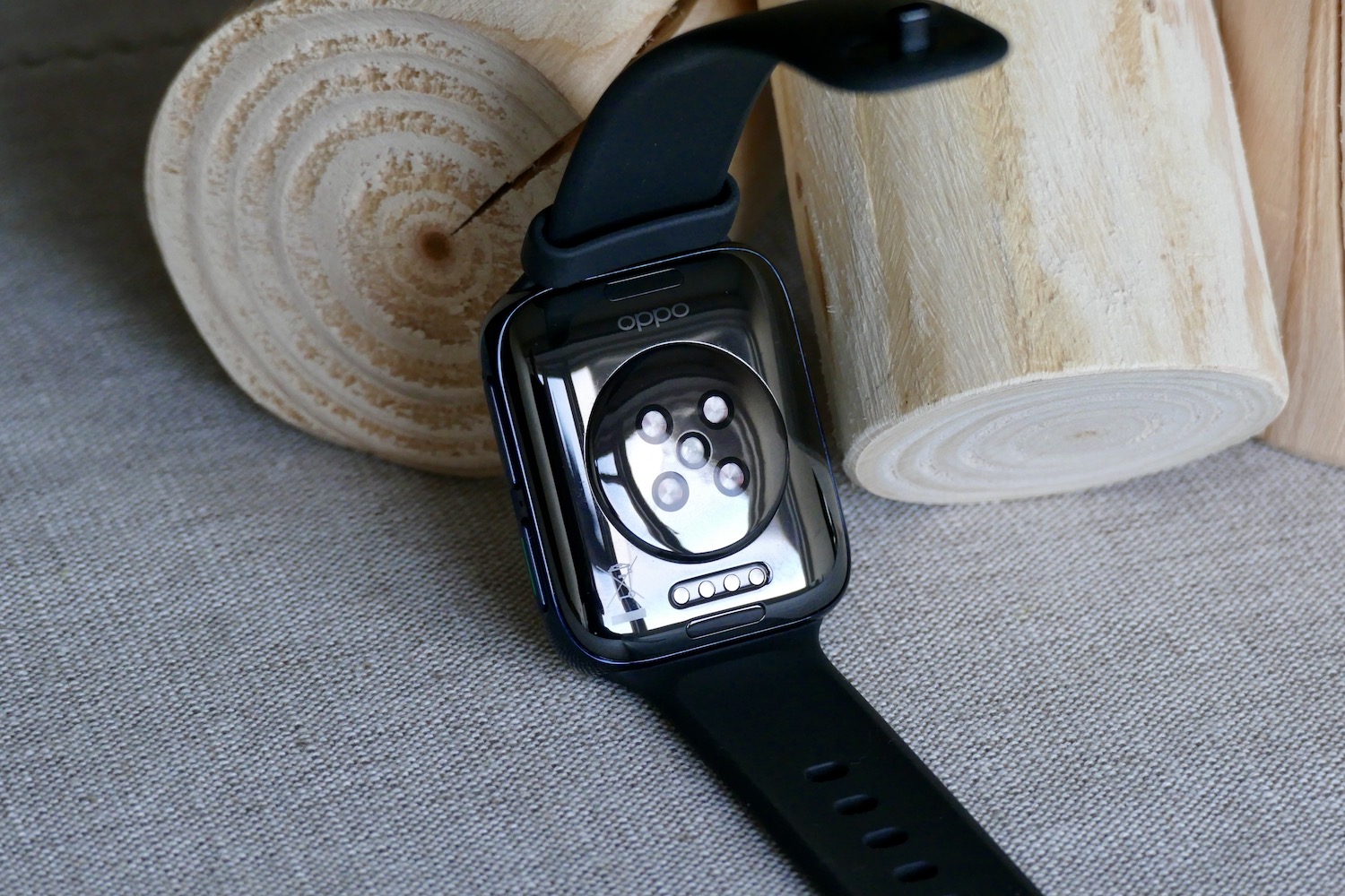
However, not adding a rotating crown to aid with navigation is a missed opportunity. The two buttons end up being a little limiting, as the vast majority of smartwatches use the crown as a third button, or to scroll through the menu without swiping the screen. Yes, the lower button can be configured manually, but the top is set to opening the menu or going back to the main watch face. You swipe the Oppo Watch’s screen a lot more than you have to on other smartwatches. That equals more frustration and more smudges.
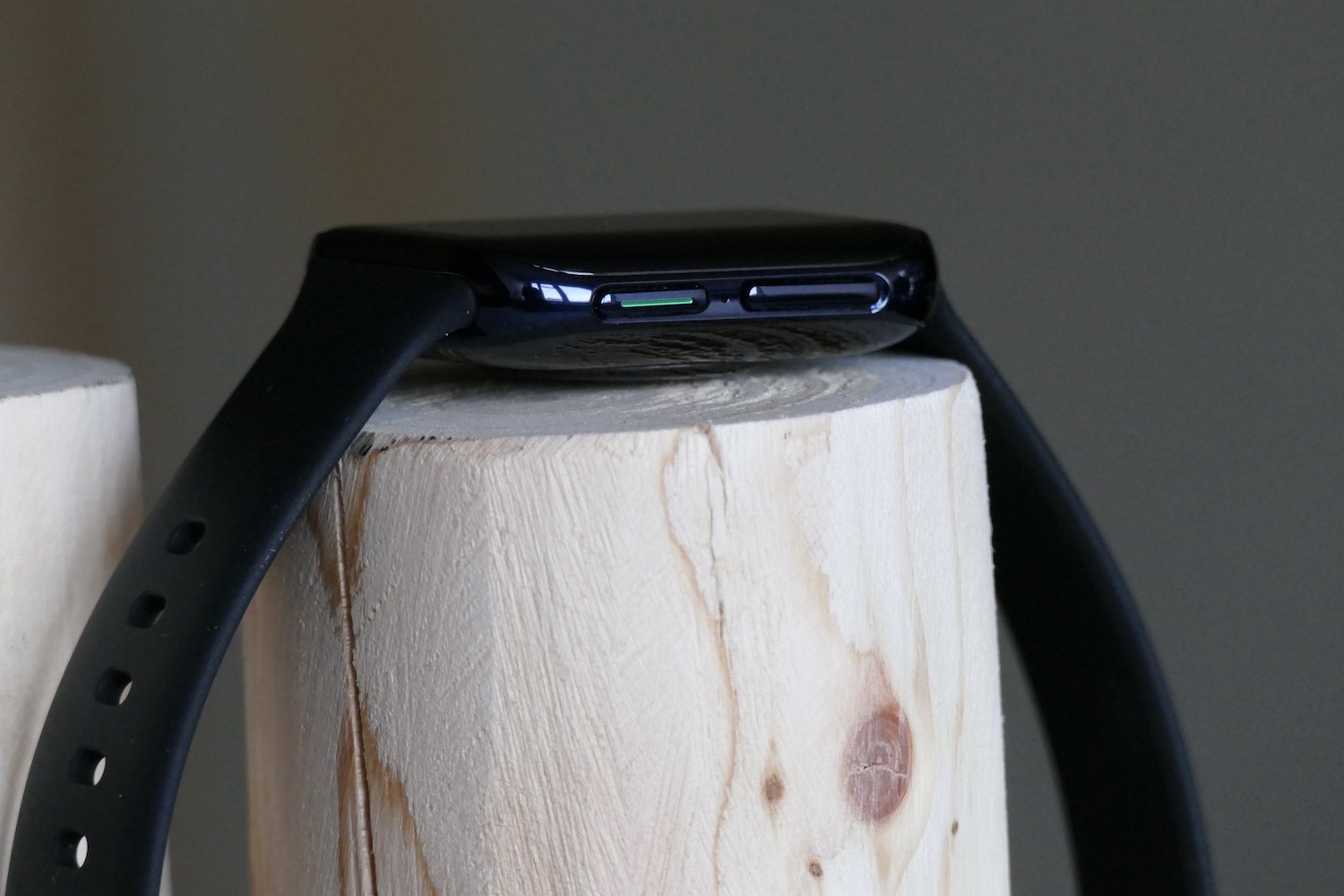
You can swap the straps out using Oppo’s quick-release system, which is just like Apple’s except you pull the strap free instead of sliding it out. It’s made of a similar flexible material to Apple’s Sport Band, but uses a keeper to hold the strap in place. The keeper slips around a lot, and doesn’t do a great job of keeping the strap held down.
Software experience
This is Oppo’s first Wear OS smartwatch, and it has mostly done a superb job with the software and overall speed. Wear OS has been adapted to work with the size and shape of the screen, with Oppo using a gridlike menu system rather than a scrolling list like most circular Wear OS watches. Otherwise, swipe gestures are the same — right to show Google Assistant, left for Tiles, down for settings, and up for notifications.
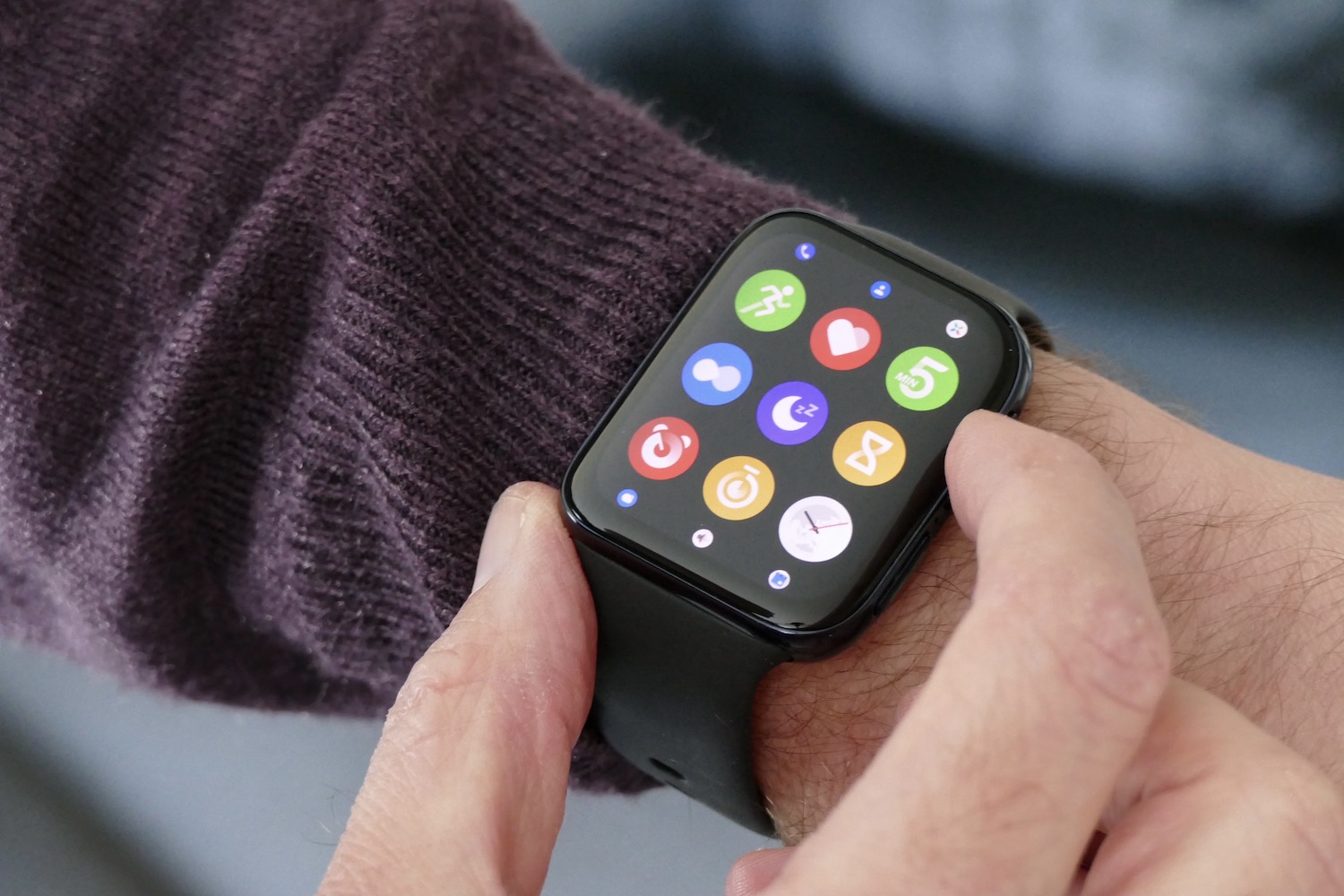
The most noticeable difference using this over many other Snapdragon 3100 smartwatches is the pleasing turn of speed. It’s smooth and responsive most of the time, but it can take a beat too long to get going after waking it up from the ambient screen. The only trouble with the main menu is that unlike a scrolling list, none of the icons are labeled, so it can sometimes be a guessing game as to which opens what app.
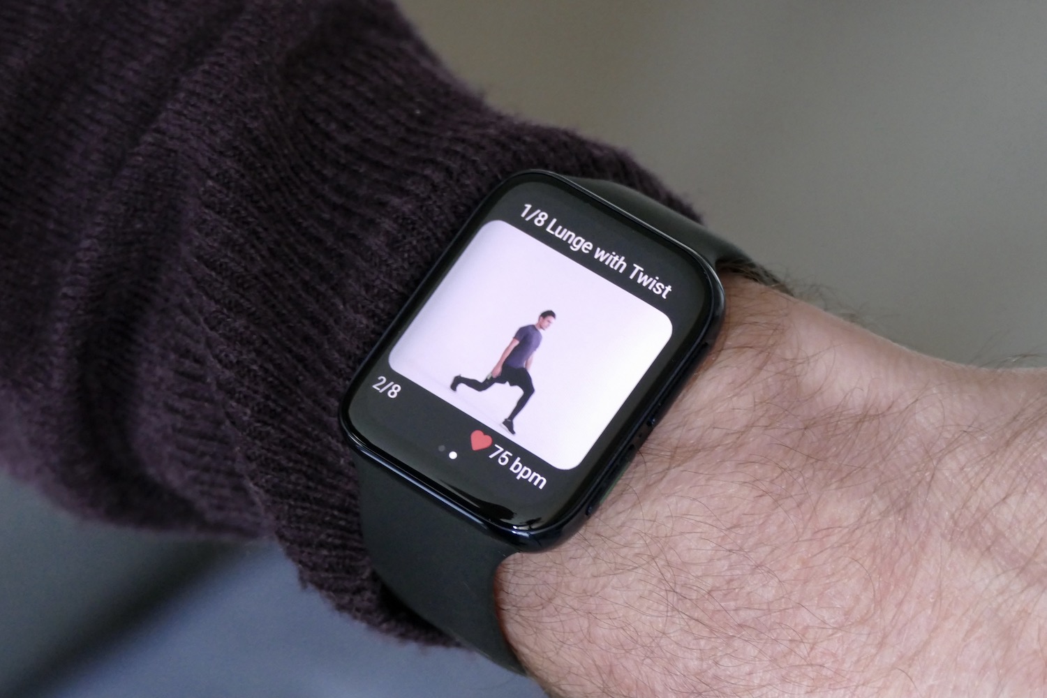
Oppo’s own fitness software is set as the default option when you press the lower button on the case. The tracking options are very limited, with no stationary bike or yoga options, for example, making Google Fit the preferred option. Oppo’s big fitness feature is the 5 Minute Workout. You can choose from a Morning Energizer, a Full Body Workout, Bedtime Stretches, and a couple of others. Each has a visual and verbal guide showing you what to do.
I recently tried a similar feature on the Honor Watch ES, but Oppo’s has far more realistic animations, although the voice guidance grates. While there’s nothing wrong with the feature, I do question why you would use it on a regular basis. I tried it out, but never felt the need to return.
Oppo’s fitness software needs refining. The fitness and activity reminders don’t link with Google Fit, for example. Also, after every workout, I received a warning that my “resting heart rate” had exceeded 120 beats per minute for too long, and it if happened again, I should see a doctor. This happened despite it tracking the workout. The movement reminders are also haphazard, only ever telling me to get up and move around after I’d just sat down.
Despite this, I do think the software and speed are reasons to choose the Oppo Watch over many other Wear OS smartwatches. The battery life has been good, too. Without the LTE connection active, the watch lasts two full days if it’s turned off overnight. Turn on Power Saver mode and you’ll get a few weeks use, but with limited features. Charging takes 75 minutes, but you can fast charge to about 45% in 15 minutes, which for me was just about enough to cover a single workday.
Why so angry?
Apple has owned the square smartwatch space from the beginning, when others struggled to introduce circular designs and sniggered at the Apple Watch’s unconventional shape. It has since become synonymous with Apple and proven to be a superb design for a wearable — and it’s impossible for any other manufacturer to replicate the shape without being compared to Apple.

The shape is supremely comfortable, making it understandable for Oppo to use it, but because it can’t add the digital crown, the controls suffer, and the strap isn’t quite so refined either. It’s not just the shape that makes the Apple Watch so good — it’s all the other aspects that go along with it, and Oppo hasn’t found a way to re-create many of them in a new way on the Oppo Watch. Combine this with the fact thatthe software is superior to many of its Wear OS rivals, and it makes me hit the desk with my fist in frustration. Oppo couldn’t even come up with a better name that simply “Watch,” drawing even more comparisons.
Sadly, because the Apple Watch is by far the best smartwatch you can buy, anything else — even a smartwatch as good as the Oppo Watch — is second-best, and harsh comparisons will be drawn when paths cross so obviously. It makes me angry because if Oppo hadn’t chosen a similar design, name, and marketing material, none of this would cross my mind. Instead, it does so every time I look at my wrist.
What does this mean for the Oppo Watch?
The Oppo Watch is not available in the U.S. but is sold in the U.K.. The 46mm LTE model here costs 369 British pounds, or about $490 U.S., and is exclusive to the Vodafone network, where you’ll have to pay extra for the LTE connection. Oppo also makes a smaller 41mm Oppo Watch without LTE, which costs 229 British pounds, or about $305, through Oppo’s own store.
The prices compare very favorably with the more expensive Samsung Galaxy Watch 3. Although the Oppo Watch is technically very good, the Samsung Galaxy Watch 3 (which doesn’t make me angry) remains our smartwatch recommendation for Android phone owners. If you own an iPhone and want a smartwatch, the only one on your shopping list should be the Apple Watch.
Does the derivative design mean you should ignore the Oppo Watch? This will really come down to personal choice, but if it’s something you can overcome, you’ll have an excellent smartwatch on your wrist. Oppo has tried something different with the software and has been mostly successful, the battery life is good, it’s great to see the option of an LTE connection if you want it, and it all comes at a sensible price.

