Google Calendar for desktop gets a long-awaited material design face-lift

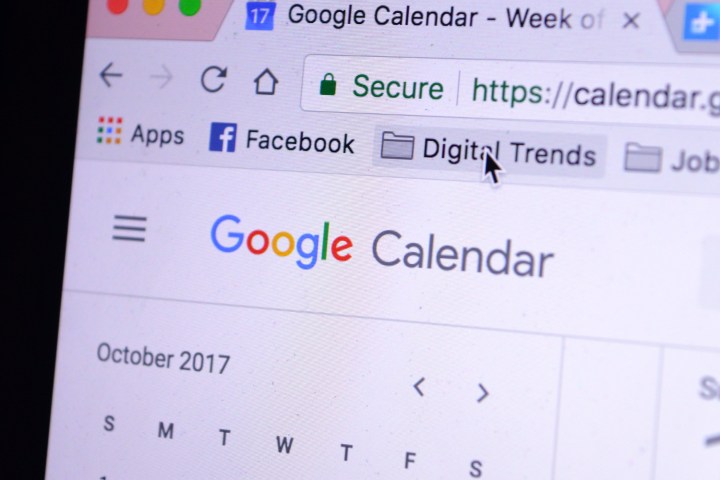
Google Calendar shown on a computer monitor.
Digital Trends
Google Calendar is a seriously awesome tool, but the desktop version of the app has felt a little outdated over the past few years. Well, folks, that’s finally changing — Google is pushing out an updated version of Google Calendar on desktop that makes heavy use of Google’s material design language.

We first knew that a Calendar redesign was in the works earlier this year when Google showed off a 2017 product roadmap, so it’s not a surprise — but it’s still nice to see the redesign.

Image used with permission by copyright holder

There are a few key changes that Google has made to the desktop version of Calendar. For starters, the website now smartly adjusts depending on the size of your computer screen, which is pretty helpful for those that like a windowed approach to their desktop. Like the previous version of Calendar, you’ll get a view of the month on the top left, under which is a list of the different calendars you have access to. On the top right you’ll find settings and a search bar, as well as a drop-down menu to change the view. The rest of the screen shows your events.

Recommended Videos

The changes aren’t just aesthetic either — you can also now do things like add links to relevant documents and spreadsheets, so if you’re creating meetings with other people within a company, you can add documents that might be helpful.

Like the previous version of Calendar, you can view your events by day, week, month, year, or four days at a time. The “Day” view allows you to view different calendar side by side, too, which could be very helpful for those that manage multiple calendars at a time.

The redesign is certainly well overdue — the apps for Calendar have featured Google’s material design for some time now, so it’s nice to see Google bringing the desktop version in line with the mobile version.

The update to Google Calendar is rolling out to G Suite users now, and G Suite admins can enable the new calendar by hitting the “Use New Calendar” link in the top right-hand corner of the interface, or you can hit this link.

Christian de Looper
Christian de Looper is a long-time freelance writer who has covered every facet of the consumer tech and electric vehicle…
Google Calendar’s ‘Focus Time’ can now deny unwanted meetings for you
google calendar focus time android

Google Calendar is getting a new Focus Time feature that will be useful for people who get a lot of meeting invites and don't have the time to attend all of them. Focus Time will now automatically deny meetings for you in a selected time slot. The feature works by indicating the working status of users, making it easier to block out time for focused individual work.

In a blog post, Google wrote that it hopes to make it easier to create dedicated time for thinking and core work for users. Focus time is said to function a lot like an Out of Office event. You can now set Focus Time on Google Calendar. It is indicated by a small headphones icon, which can be customized in terms of color so each entry looks different from one and another.

Read more
How to share a calendar in Google
Google Calendar

Google Calendar is a great way to keep track of appointments, birthdays, events, and more. It’s a free service made available to every platform under the sun. But there may be a time when you need to coordinate with others, and that’s where sharing calendars come into play.

This guide shows you how to share a calendar in Google. It's quick and easy, but it must be done through the Google Calendar website, not the apps. Other users don’t necessarily need a Google account either, as they can access your Google Calendar using a shared link.
How to share a calendar in Google

Read more
Google redesigns Gmail and Calendar logos, ditching long-standing looks
google gmail new logos workspace icons

It's the end of an era for Gmail. The well-known red-and-white envelope logo for the service is finally being retired, to be replaced by a multi-color icon that brings Gmail in line with the rest of Google's modern colorful logo designs. The new logo still has a vague callback to the old envelope, but now the most prominent characteristic is that it's just an "M" on a white background.

There's a similarly big change for Google Calendar, which gives up its flipping pages for a square aesthetic and was also one of the few apps that previously didn't use the multicolor palette. Smaller refreshes are seen in Google Drive, Docs, and Meet.

Read more