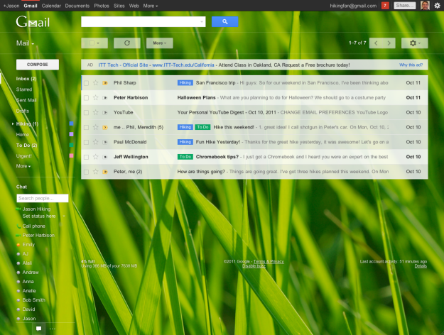
 In what was possibly the worst kept secret, Google has redesigned Gmail. Google officially confirmed today that the newly redesigned Gmail is now available to all users. If you want to update to the new look there should be a green “Switch to the new look” button on the bottom right of your Gmail screen. Most of the key new features were leaked in October, so this might not be a surprise for you, but we included the video tour below to refresh your memory.
One thing you will notice is how clean the new Gmail looks. It is designed to adjust to the size of the screen you are using so that no matter what size screen you are using you will have the best possible experience. If you are a big time chatter on Gmail you will be able to adjust the size of the chat boxes, or if you don’t chat at all you can hide them completely. Gmail will learn how you use the system and adjust for you, even if you don’t make a single change.
It is nice to see Google focusing not just on the function of the service, but also on the design. We can see Google’s new dedication to design in its recent redesign of Reader, and it also sounds like design played a big role in the rumored iOS Gmail app.
We recently updated to the new look, and are still trying out all of the new features, but it is far too soon for us to officially weigh in on if it is an improvement or not. What are your first thoughts of the new look?


