Does something look different to you? Yelp redesigns its home page

social media privacy apps settlement yelp phone 0001
Image used with permission by copyright holder
First impressions can be everything. No one knows this better than Yelp, a site that has cut its teeth on sharing users’ impressions with others. And to ensure that it’s making a good impression itself, the review site is starting the year with a new look — that’s right, Yelp has a new desktop homepage redesign that it hopes will keep you coming back for more.

Image used with permission by copyright holder

“The new homepage features an emphasis on visuals and photos with some of the best shots on Yelp (credits included for each Yelper!) behind the larger search bar,” product manager Lindsay Goyne explained in a blog post announcement on Monday. “Why? Yelp is all about high-quality, reliable, and useful content from members of our community so that you can really get to know your local businesses.”

The site is also placing business categories like home and local services front and center in order to remind users that you can find just about anyone and everyone on Yelp, whether you’re looking for a drink, a doctor, or an adventure.

Image used with permission by copyright holder

Yelp notes that its redesigned homepage will highlight content from its millions of monthly visitors, community managers, and elite Yelpers. The most popular of new businesses, categories, and user activity will be displayed for all to see. If you are logged into your Yelp account, you’ll also be able to check out businesses you’ve recently visited online, and recent activity can be sorted by nearby users, friends on Yelp, and people you follow.

And given the popularity of messages (like Request a Quote), you can now access your communication directly through the homepage by way of a new icon on the top-right corner of your screen. “All these changes are designed to help users better navigate Yelp, find what they’re looking for quicker, and better understand who we are and how we can help,” Goyne wrote.

This wasn’t a change that came about overnight, Yelp noted. Rather, this change has been months in the making, and the site wanted to ensure that it would share the most “authentic, emotional, local experiences” possible.

“Our goal in redesigning the Yelp homepage was to increase searches, promote new business discovery, and better showcase our active community and their authentic content,” Goyne concluded. “For Yelp users who write reviews and upload photos, we hope the redesign will remind you to share a review of the awesome car mechanic you just discovered, or upload photos of the restaurant you ate dinner at last night.”

So get reviewing, Yelpers. There are always new impressions to be made.

Lulu Chang
Former Digital Trends Contributor
Fascinated by the effects of technology on human interaction, Lulu believes that if her parents can use your new app…
How to change margins in Google Docs
Laptop Working from Home

When you create a document in Google Docs, you may need to adjust the space between the edge of the page and the content --- the margins. For instance, many professors have requirements for the margin sizes you must use for college papers.

You can easily change the left, right, top, and bottom margins in Google Docs and have a few different ways to do it.

Read more
What is Microsoft Teams? How to use the collaboration app
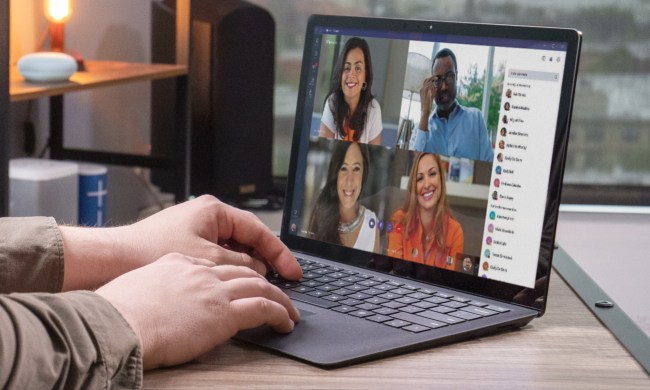
A close-up of someone using Microsoft Teams on a laptop for a videoconference.

Online team collaboration is the new norm as companies spread their workforce across the globe. Gone are the days of primarily relying on group emails, as teams can now work together in real time using an instant chat-style interface, no matter where they are.

Using Microsoft Teams affords video conferencing, real-time discussions, document sharing and editing, and more for companies and corporations. It's one of many collaboration tools designed to bring company workers together in an online space. It’s not designed for communicating with family and friends, but for colleagues and clients.

Read more
Microsoft Word vs. Google Docs
A person using a laptop that displays various Microsoft Office apps.

For the last few decades, Microsoft Word has been the de facto standard for word processors across the working world. That's finally starting to shift, and it looks like one of Google's productivity apps is the heir apparent. The company's Google Docs solution (or to be specific, the integrated word processor) is cross-platform and interoperable, automatically syncs, is easily shareable, and perhaps best of all, is free.

However, using Google Docs proves it still has a long way to go before it can match all of Word's features -- Microsoft has been developing its word processor for over 30 years, after all, and millions still use Microsoft Word. Will Google Docs' low barrier to entry and cross-platform functionality win out? Let's break down each word processor in terms of features and capabilities to help you determine which is best for your needs.
How does each word processing program compare?
To put it lightly, Microsoft Word has an incredible advantage over Google Docs in terms of raw technical capability. From relatively humble beginnings in the 1980s, Microsoft has added new tools and options in each successive version. Most of the essential editing tools are available in Google Docs, but users who are used to Word will find it limited.

Read more