“Denon’s Heos takes a shot at Sonos, but misses its target.”
- Big, powerful sound
- Attractive form factor
- Intuitive new speaker grouping feature
- Responsive and easy to use EQ
- App wrought with playback issues
- No obvious Mac playback method
- Midrange and upper register lack presence and detail
- UI not as intuitive as Sonos
Everyone wants a shot at the champ. Ten years after Sonos pioneered the modern multi-room speaker system, speaker and electronics makers alike have lined up to get in on the action.
Denon’s shiny new Heos ecosystem is the latest to take on the challenge. Sticking to the tried-and-true Sonos formula, Denon’s curvy black components come in a Goldilocks’ Three Bears array of sizes: The big H7, the medium H5, and the baby H3. Denon promises premium sound quality – and begs a premium price — but the Heos have their work cut out for them if they want to best Sonos there.
And when it comes to multi-room speakers, sound quality is only part of the equation. Convenience and dependability are just as important, if not more so. How did Denon do? Read on to find out.
Hands on video
Out of the box
As the big boy of the brood, the H7 speaker is pretty brawny, with a teardrop shape and a mesh speaker screen. The speaker is heavy, and since it has no handle, it isn’t easily portable. As expected, the H5 is the spitting image of its elder, only scrunched together into a more concise shape, with a lot less weight to pack around. The H3 is the odd man out, shaped into a curvy tower that is highly reminiscent of Sonos’ Play:1 canister.
The H3 is a curvy tower, highly reminiscent of Sonos’ Play:1 cylinder.
All of the speakers share a monochromatic color scheme in black or white, and offer succinct controls along their matte plastic exteriors, though the added volume controls make them less minimalist than Sonos’ single-button design. At the back of each speaker rests an input panel with an Ethernet connection, a “connect” button for wireless setup, and an Aux input, which also acts as a sort of bridge for Wi-Fi setup via smartphone.
Accessories inside each box are few, including only a power supply, a 3.5mm cable, and a small packet of quick-start instructions.
Setup
Sonos’ most beautiful and popular feature is its systems’ extremely simple setup. With the original Bridge add-on component, which directs all speakers to your Wi-Fi network, Sonos speakers setup in seconds with a simple touch of a button. Now that the $50 Bridge is no longer needed, the first speaker takes a bit longer to setup, but the rest follow the one-button launch format.
While it isn’t something you’ll have deal with often (hopefully), the Heos’ setup process makes it fell like it’s a generation behind. Users are required to plug into the Aux port, push the connect button, and complete a short series of tasks dictated by the Heos app. While connection usually took about two minutes, a few of our attempts took longer, even requiring closing the app and restarting, or simply waiting extended periods. It wasn’t terrible, but it also wasn’t Sonos-quick — and that’s where the bar is set.
Features and design
Each of the three Heos speakers pack a hefty load of internal components, as well as digital signal processing from Waves’ MaxxAudio system to help create a more powerful sound than what you’ll get from the Sonos trio — and though they certainly are powerful, that’s not always for the better.
The H3’s ported cabinet and heavy DSP make it sound a lot bigger than expected.
As mentioned above, the speakers all share a uniquely rounded form factor (though the H3 goes its own way) as well as a conspicuously illuminated bar on the front that relates setup and playback status, as well as exhibiting mute and volume adjustment.
The more compact H3 (10.7 x 5.1 x6.5-inches) fits nearly anywhere, plus it can be oriented vertically or horizontally. A threaded insert on the back also allows it to be wall- or ceiling-mounted Inside, just two drivers pull the load, powered by dual-channel Class D amplification. Small as it may be, the H3’s ported frame and heavy DSP make it sound a lot bigger than you’d expect. The H3 also marks the only speaker in the family that can be stereo paired with another of its kind.
Heos App
When it comes to wireless multi-room speaker systems like this, premium sound quality is important, but it’s really all about the interface and playback features, and that means it’s all about the app. Denon borrowed heavily from Sonos here (like most multi-room systems we’ve seen).
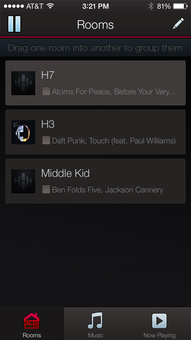
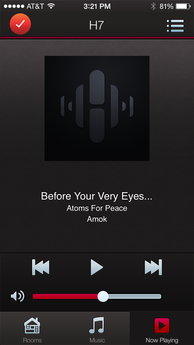
The system offers three simple navigation windows to choose from, including Rooms, which shows you which devices are playing from which sources, Now Playing, which is essentially the same as what you’ll see in your phone’s iTunes or Google Play window, and Music, which allows for source selection as well as offering the only access to the settings icon to dig into the bones of the system. Along with some advanced features, the settings area holds the all-important bass and treble controls.
In addition to your smartphone or DLNA-equipped PC music library, current HEOS-capable sources include Spotify, Pandora, TuneIn, and Rhapsody. Good headliners, but not nearly as diverse as Sonos, which has had a decade to broker partners. Also, the Heos system offers no Airplay support, and we couldn’t find any obvious way to source files from our Mac such as the dedicated Mac apps for Bose and Sonos. There is a workaround for its lack of Mac support by using a third party DLNA server app such as Plex, but that’s an extra step we’d prefer to avoid.
We found some attractive features while auditioning the app. Grouping speakers is a breeze, done by simply dragging and dropping, or pinching a large group of speakers together. Volume control followed our phone’s hard keys, which made adjustment on the fly intuitive, and although we wished it was accessible from any window, the EQ system was responsive and easy to adjust — a must for this bassy bunch.
However, some drawbacks to the design gave us real pause. We couldn’t seem to find any easy way to fast-forward or back up in the middle of a song, for instance. Scrubbing did not work for us during playback from our phone’s sources, though it does work with services like Spotify. Also, only the H3 can be stereo paired, doing us no good with our tiered collection. And perhaps most annoying, in our initial testing when multiple speakers were grouped together, there was no obvious way to affect individual volume control, detracting from the magical feeling of wireless audio omnipotence. At Denon’s request, we recently retested the volume function while grouped, and a pop-up window offered easily accessible individual volume control. Whether the issue was a bug in our initial app is unclear, but Denon claims it has always been available.
The app felt like a beta version, wrought with recurring problems.
But, unfortunately, the primary trouble that arose during evaluation of the Heos app was a simple lack of reliability. The app felt almost like a beta version, wrought with recurring problems including spotty playback, playlists we created that seemed to disappear (and then reappear later), and a habitual message reading “unable to play media,” which showed up more often than we could count when sourcing our iPhone 5’s music collection.
We could normally chalk up some of the app’s quirks to our congested office Wi-Fi, but many also reared their heads when we took the system home. It’s possible (likely, even) that Denon will address many of these issues in firmware updates. But as of now, the Heos app is not ready for the big leagues.
Audio performance
The word that comes most readily to mind after spending a couple of weeks with Denon’s Heos system is HEAVY. We’re not sure how things will change in the post-Apple era, but based on past experience, if Beats made a multi-room speaker system, we’re pretty sure it would sound a lot like Denon’s Heos. Though there are obvious differences as you transition throughout the family, each of the speakers offers a thick layer of bass, coupled with an upper register that lacks the presence and detail we expected from an old pro like Denon.

In some ways, the H3 seems to embody the Heos sound at its most concentrated, bringing to bear a powerful punch of bass, sprinkled with light and tinkly treble, without the pop or breadth necessary to give life to the meat of the midrange, where so many instruments live and breathe. Cymbals and acoustic guitar strings seemed to jingle like sleigh bells, while the bass layered a heavy coat along the bottom that swelled into the midrange to saturate vocals and stringed instruments.
We were able to obtain some balance by futzing with the EQ, but we often had to choose between a heavy sound, and a light and brittle one, without much middle ground. It was also fairly easy to court distortion when volume crept much above the halfway point. While it definitely packs a powerful punch, just like one of those weird Hollywood couplings between a monstrous oaf and a tiny pixie, there’s something unnatural about the H3’s sound signature.
Conclusion
With app inconsistencies, a lack of Mac compatibility, and audio performance that fails to rise above the crowd, Denon’s Heos multi-room speaker system was at best underwhelming, and at worst, downright annoying. Even if big bass is your pleasure, the system falls short of the detail and accuracy expected at this price point, while the spotty app simply isn’t ready for primetime. If anything, Denon’s Heos system proves that, in the multi-room game, Sonos still reigns supreme.
Highs
- Big, powerful sound
- Attractive form factor
- Intuitive new speaker grouping feature
- Responsive and easy to use EQ
Lows
- App wrought with playback issues
- No obvious Mac playback method
- Midrange and upper register lack presence and detail
- UI not as intuitive as Sonos


![The JBL Xtreme 4 Bluetooth speaker. [Embargoed image 06/03]](https://www.digitaltrends.com/wp-content/uploads/2024/05/jbl-xtreme-4-review-in-water-o2.jpeg?resize=650%2C390&p=1)

